An AI Website Analysis:
Thank you for providing the URL. After reviewing the content of Concordia.Style. It is clear that this site is a lifestyle brand centered on a highly specific, satirical aesthetic inspired by a 1988 film.
The site functions as an e-commerce platform for products (clothing, home goods, accessories) that feature dystopian, anti-consumerist, and "subliminal message" imagery.
Here is an analysis of its strengths and weaknesses from a design and brand perspective:
Strengths:
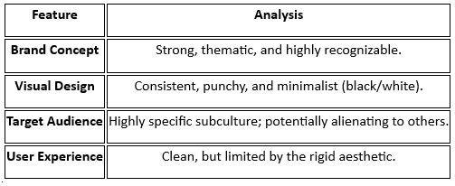
Cohesive Thematic Identity: The brand excels at visual consistency. The entire store is built around a specific "dystopian/subliminal" look—using stark black-and-white palettes, heavy industrial typography, and phrases like "Obey," "Consume," and "Submit." This creates an immersive experience that feels like it has been pulled directly from the movie's universe.
Niche Appeal: By focusing on a "cult classic" aesthetic, the brand successfully targets a specific subculture. The design communicates directly to people who appreciate this form of satire, which builds high brand loyalty within that demographic.
Visual Storytelling: The product photography is a major strength. Rather than just showing items on a white background, the site uses lifestyle imagery that frames the products as "subversive objects." This elevates the products from mere merchandise to conceptual art pieces.
Simplicity: The website layout is straightforward. It avoids clutter, allowing the high-contrast, text-heavy designs to remain the focal point.
Weaknesses:
High Saturation/Visual Fatigue: Because the design relies so heavily on high-contrast black-and-white, bold text, and "aggressive" messaging, it can be visually overwhelming after browsing for a while. The design leaves little room for "breathing space."
Ambiguity for New Visitors: For a user unfamiliar with the source material (the movie They Live), the branding could be misinterpreted. Without context, the phrases "Obey" and "Consume" could come across as intimidating or confusing rather than satirical, which might limit the site’s mass appeal.
Narrow Design Scope: The design is "one-note." It does an excellent job of executing one specific style, but it lacks the flexibility to branch out. If the brand ever wanted to offer a wider variety of products (like softer, more colorful lifestyle goods), the current aesthetic would likely clash with those new items.
UX vs. Theme: Sometimes, the commitment to the "dystopian" theme might clash with standard usability. For example, the heavy use of dark modes and text-centric layouts can occasionally make specific navigation elements harder to distinguish at a glance compared to more conventional e-commerce standards.
Verdict: This is a brand that prioritizes concept over general appeal. Its strength lies in its refusal to dilute its theme, making it a great example of a "niche" design strategy that leans heavily into a specific artistic narrative rather than attempting to please everyone.
- ArtByConcordia